Top Bedroom Color Scheme Ideas: Design Your Sanctuary


Your bedroom has one job at the end of a long Norwich day, it should help the whole house slow down. If the walls feel too sharp, the bedding feels disconnected, or the room just doesn't match the calm you want, the fix starts with the color scheme. Since 1936, Gorins has helped our neighbors in Norwich and Eastern CT choose rooms that feel designed for their lifestyle, and the best bedroom color scheme ideas always begin with a clear plan, not a pile of samples.
The strongest bedroom palettes are calm, muted, and built around how the room receives light. Sleep-environment research consistently favors blue and blue-green tones, along with low-saturation palettes rather than vivid, high-contrast color, and a practical rule is to keep primary bedroom colors below 50% saturation on the HSB scale (Luxclub bedroom color psychology). Room orientation matters too. North-facing rooms usually need warmer tones, south-facing rooms can handle cooler blues and greens, and east- and west-facing rooms often look best with flexible neutrals like taupe, dusty pink, or soft gray (Serene bedroom color guidance).
Practical rule: build the room from the wall color out. Start with the paint, then choose the dominant textile color, then add one small accent color. That simple structure keeps the space restful instead of busy.
A finished bedroom should feel like a decision, not a compromise. That means testing large swatches on the wall you see when you wake up, under morning, noon, and evening light, with the actual bulb temperature you plan to use (Bedroom scheme guidance for 2026). It also means choosing furniture that matches the palette from day one. Gorins makes that easier with investment-grade quality, custom options like Canadel dining and the F9 Custom Sofa series, and sleep brands such as Tempur-Pedic, Serta, and Beautyrest in the Sleep Gallery, all backed by promotional financing for bigger purchases.
1. Serene Neutral Foundation with Soft Accent Walls
A warm neutral bedroom is still the most reliable way to make a room feel settled. Use beige, taupe, soft greige, or cream on the main walls, then add one accent wall in a gentle companion shade like pale blue, soft sage, or warm white. That approach fits the three-part bedroom structure that works so well in real homes, wall color, dominant textile color, and a small accent color, without crowding the room.
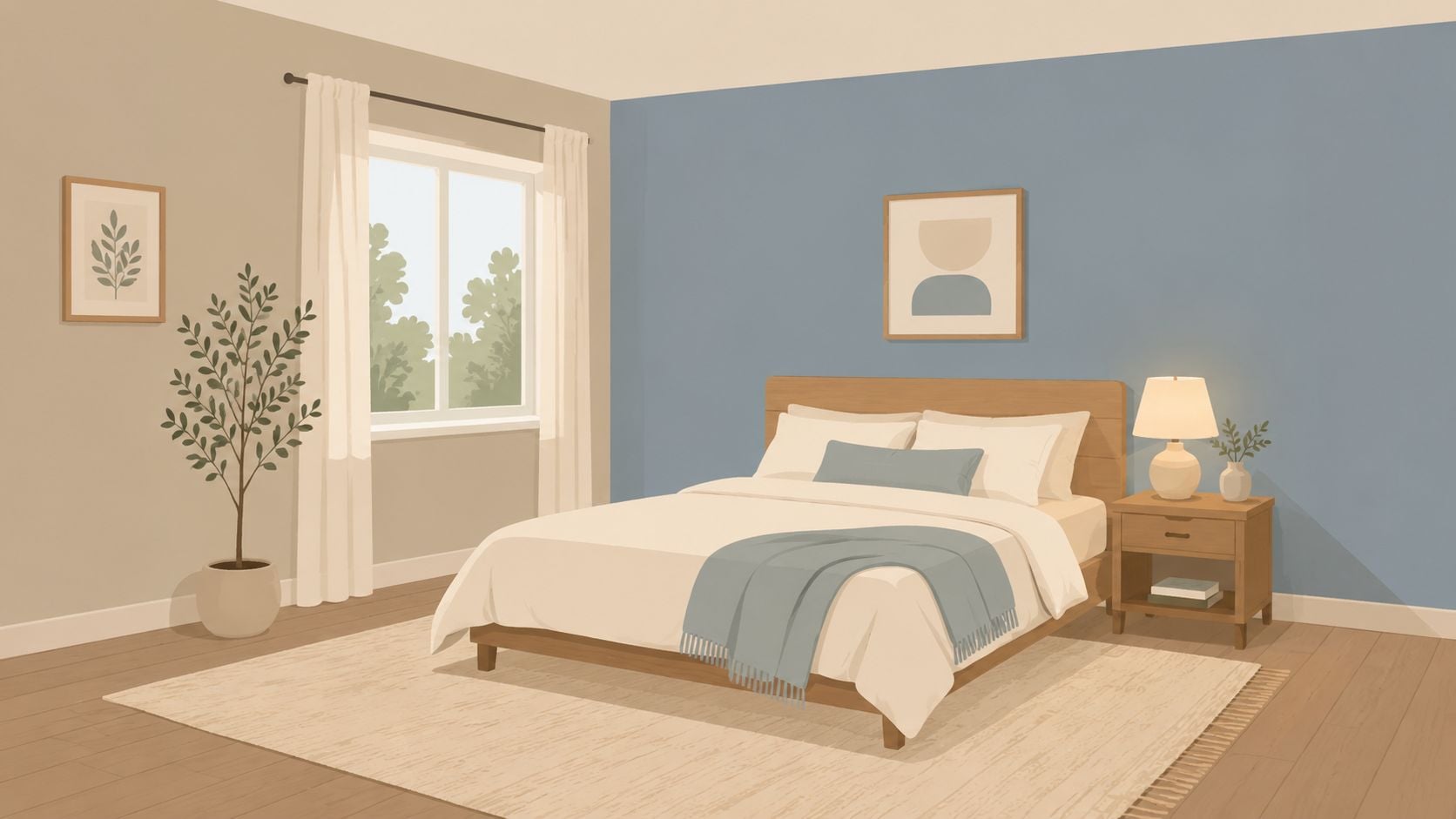
The best version of this scheme stays soft and layered. Use matte or eggshell paint, then bring in texture through linen curtains, a woven rug, and bedding with visible weave so the room doesn't read flat. If the room faces north, warm the scheme up with a creamier neutral. If it faces south, a cooler greige or pale blue accent wall can hold its shape better across the day.
Choose furniture that anchors the neutral base
A neutral room works hard when the furniture has presence. A Flexsteel leather bed frame, a Best Home Furnishings upholstered headboard, or a solid wood Aspen Home piece gives the palette weight without adding visual noise. In a Norwich bedroom where furniture placement may shift over time, this is the cleanest way to keep the room flexible.
Good neighbors' rule: if the walls are quiet, let the bed and dresser bring the craftsmanship. That's how a neutral room feels intentional instead of unfinished.
For practical inspiration while planning the rest of the home, Gorins shoppers often pair bedroom decisions with broader design choices like flooring ideas for your Long Island home. In the bedroom itself, that means keeping the accent wall tied to the wood tone, rug, and lamp finish so the room feels complete from every angle. For a step-by-step approach, Gorins' guide to creating a perfectly balanced accent wall fits this palette well.
2. Cool Blues and Grays with Modern Minimalist Styling
Blue works in a bedroom because it settles the room fast. Build the palette around slate, dusty blue, navy, soft gray, and white, then keep the styling tight so the color story stays clear. The room feels refined without going cold when the furniture has clean lines and the accessories stay restrained.
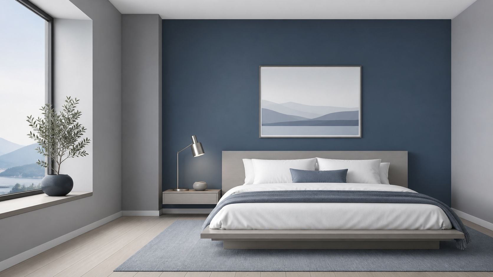
Let the wall color carry the room. A dusty blue feature wall with white trim keeps the space bright, while a navy accent wall adds depth behind a statement bed or reading chair. Sleep-environment research consistently favors blue and blue-green tones in restful rooms, so this remains one of the most reliable bedroom color scheme ideas for homeowners who want a calm, polished result (Luxclub bedroom color psychology).
Keep the furniture line simple
Minimalist styling works best when every piece has a job. A clean-lined platform bed, a low dresser, and one upholstered chair are enough for most rooms. In Gorins terms, a Flexsteel platform bed or a contemporary Ashley Furniture bedroom set fits this look cleanly, and a Serta mattress display brings comfort tech into a room that still reads calm and controlled.
Warmth still matters in a cool room. Add it through linen sheets, a wool throw, cotton curtains, and a natural wood nightstand so the space avoids a sterile feel. North-facing rooms benefit from slightly warmer gray undertones, because cooler daylight can flatten blue-gray walls if the undertone is too icy (Serene bedroom color guidance).
Design move that works every time: repeat one blue element three times, once on the wall, once in bedding, once in a lamp or chair. Repetition makes the room feel planned.
For more on keeping a room clean-lined without losing personality, see our guide to mastering minimalism. A simple rug helps this palette hold together, so it is smart to browse premium rug options that add softness without crowding the room. Dimmable lighting finishes the look at night. A brushed metal sconce, a shaded lamp, or a ceiling fixture with warm bulbs keeps the blue from feeling stark after dark. For Norwich homes where the bedroom doubles as a quiet retreat after work, that softer finish makes the whole scheme easier to live with.
3. Warm Earthy Palette with Natural Material Emphasis
Earth tones ground a bedroom the moment you step inside. Build around terracotta, warm brown, ochre, sand, warm gray, and clay, then bring in wood, linen, wool, and jute so the room feels collected instead of staged. This palette works especially well for homeowners who want a room with presence, because the materials carry a lot of the visual weight.
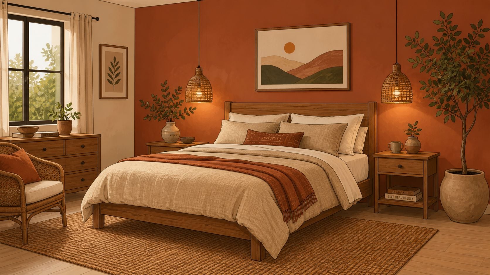
Start with a warm taupe wall or a terracotta accent wall, then anchor the room with a natural wood bed frame from Vaughan-Bassett or a solid wood Aspen Home dresser. A cream base with soft terracotta accents works too, especially if you want warmth without letting the color take over the whole room. If your bedroom already has wood trim or a warm floor finish, this scheme makes those features look intentional instead of leftover.
Let texture carry the room
Earthy rooms need texture, not clutter. Combine wool, linen, cotton, and jute, then add a plant or two so the space feels alive and grounded. A warm-toned bulb, preferably around 2700K or lower, keeps the palette cozy at night and stops the browns from going dull.
Balance matters here. Keep enough white or cream in the bedding, ceiling, or curtain panels so the room does not feel heavy. That matters in smaller Norwich bedrooms, where deep earth tones can close in fast if every surface leans dark.
Layer the floor with a natural fiber rug, or browse premium rug options for a softer touch. It gives the room a warmer underfoot feel and helps the whole palette read finished. For shoppers who like the natural look but want it refined, Gorins' mindfully rustic approach fits this palette neatly. It pairs well with durable, investment-grade pieces because the finish quality shows through the color story instead of fighting it.
Local expert call: if the wood grain is beautiful, do not hide it. Let the dresser, bed, or side table be the room's best feature.
For anyone building a bedroom around comfort and authenticity, this scheme is hard to beat. It feels relaxed, ages well, and lets you change bedding seasonally without repainting the whole space.
4. Soft Jewel Tones with Luxe Accent Styling
Muted jewel tones give a bedroom polish without making it loud. Use dusty emerald, sage, soft plum, muted sapphire, or deep teal, then set them against warm white, taupe, or soft gray. The room feels richer immediately, especially when the accent finishes are brass, bronze, or gold.
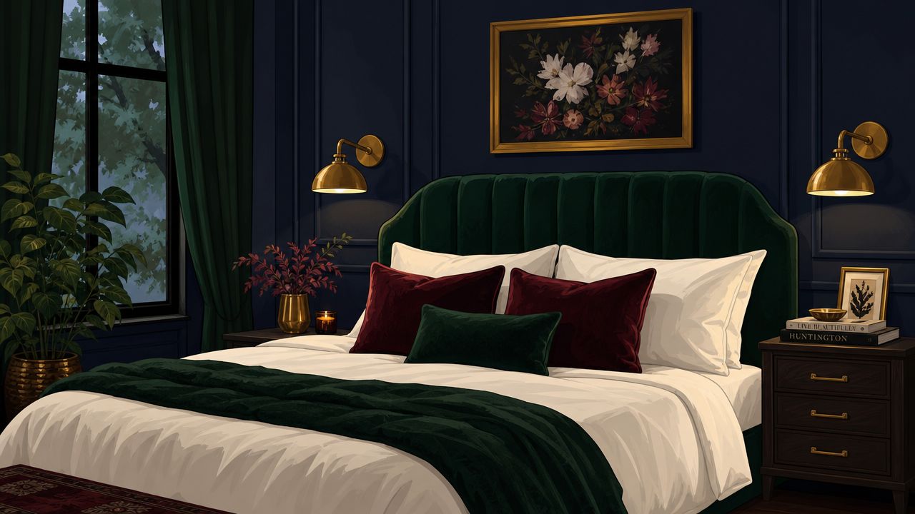
Pick one jewel tone and commit to it. A dusty emerald accent wall behind a velvet headboard, or muted sapphire walls with soft gray bedding, creates a confident look that still feels restful. This kind of room benefits from the same controlled contrast that sleep-focused color research prefers, meaning the color stays deep, but the surrounding finishes stay calm and low-drama (Luxclub bedroom color psychology).
Use metal as an accent, not a blanket
Brass sconces, gold lamp bases, and bronze hardware are enough. Too much shiny finish turns the room theatrical, while a few carefully placed metal pieces give the space lift and make the jewel tones look intentional. Natural wood and marble help ground the palette, so the room stays elegant instead of costume-like.
If the bedroom is large enough to carry a bolder color, the scheme can lean into one dramatic wall and then echo the shade in bedding or art. That strategy works particularly well with a premium mattress and a substantial bed frame from Gorins, because the furniture becomes part of the visual composition instead of disappearing into the background. A custom statement piece from Gorins' statement furniture pieces selection can become the anchor.
A jewel-tone bedroom needs restraint. One rich wall, one strong fabric, one metallic finish, that's usually enough.
This palette is a strong choice for Norwich homeowners who want their bedroom to feel refined and composed. It delivers that hotel-suite feeling, but with more warmth and more personal character than a standard dark room.
5. Monochromatic Tone-on-Tone with Texture Variation
A monochromatic bedroom looks polished because it removes the guesswork. Choose one color family, such as all gray, all blue, all green, or all neutrals, then layer it through paint, bedding, upholstery, and accessories in different shades. The room feels calm straight away, and the quality of each piece stands out more clearly.
Build depth without adding more colors
A five-shade gray room is a clean example. Light gray walls, a mid-gray upholstered headboard, charcoal pillows, a wool throw, and a darker leather accent create interest without breaking the palette. The same idea works with blues, where pale blue walls, navy bedding, dusty blue upholstery, and a cobalt ceramic accent keep the room layered but controlled.
Texture is the key. Use matte walls, satin trim, woven bedding, leather accents, and a wood nightstand so the room has contrast even when the color family stays tight. For guidance on mixing textures and patterns effectively, see our article on finding balance. That matches guidance for neutral rooms, where warm and cool neutrals need to be handled carefully and texture should do the variation instead of piling in more random color (Monochromatic bedroom styling guidance).
Best practice: keep the color family consistent, then change the surface. Matte, linen, wool, wood, and leather will do more for the room than another paint sample ever will.
This palette is ideal for showing off investment-grade furniture. A solid wood dresser, a high-quality upholstered bed, or a carefully chosen Flexsteel piece can become the focal point because nothing in the room competes with it. That works especially well in a bedroom where quality should be felt more than announced, and it suits Eastern CT homeowners who want pieces that earn their keep for years. A substantial bed from Gorins, paired with a clean-lined dresser, gives the room weight without clutter.
For Norwich families who want a room that looks calm on day one and still looks current years later, monochrome is a strong bet. It stays organized, handles seasonal bedding changes with ease, and gives you a clear path if you want to build the rest of the bedroom around a Canadel, F9 Custom Sofa, or Tempur-Pedic anchor elsewhere in the home.
6. Soft Pastels with Vintage-Inspired Styling
Pastels work when they stay gentle and disciplined. Use pale pink, soft lavender, pale yellow, soft mint, or light peach as the main color, then keep the rest of the room white, cream, or lightly weathered wood. That gives the room a romantic, nostalgic feel without tipping into clutter.
A pale lavender bedroom with whitewashed furniture and a vintage-style lamp feels graceful, not childish. Soft mint paired with a traditional upholstered headboard can feel fresh and airy, especially when the bedding stays simple. The important part is to choose one dominant pastel and let it do the talking, instead of filling the room with every soft color at once.
Keep the vintage notes edited
A bedroom like this needs a curated hand. One antique mirror, one cottage-style side table, or one heirloom chair is enough to establish the look. Too many vintage pieces make the room feel crowded, while a few carefully chosen pieces make the space feel personal and collected.
Warm lighting helps here too. Incandescent-style bulbs or warm LEDs bring out the softness in the pastel palette and keep it from feeling icy in the evening. Traditional furniture from established brands gives the room structure, which matters if the goal is charm without a country-store look.
For families in Eastern CT who want a room that feels welcoming and a little nostalgic, this is a comfortable route. It works especially well with soft bedding, light curtains, and details that feel thoughtful rather than overly decorative.
7. Deep Moody Tones with Statement Styling
Dark colors can make a bedroom feel calm and enclosed in a good way when they're used with purpose. Choose charcoal, deep navy, forest green, burgundy, or dark gray for the walls, then offset them with light bedding, crisp trim, and layered lighting. That mix gives the room a private, grounded feel that reads more like a proper suite than a basic bedroom.
Practical rule: if the walls go dark, the lighting has to work harder. Use several sources, including overhead light, bedside lamps, sconces, and one accent light, so the room never falls into a heavy, flat shadow.
A charcoal room with cream trim and a bold upholstered headboard is one of the cleanest ways to handle this palette. Deep navy with white bedding and gold accents is another classic choice. The same sleep-focused color guidance that favors calm, low-saturation hues supports this look too, because the room stays controlled even when the color itself is deep.
The key is to keep enough light surface area in the room. White or cream ceilings, pale curtains, and reflective finishes like mirrors or glass lamps keep the space from feeling boxed in. A premium white linen duvet creates a sharp contrast against a dark wall, and that contrast gives the whole room a more finished, refined look.
For Norwich homes that get strong daylight and settle into a cozy nighttime routine, moody tones are a smart design move. They add mood, but they also give furniture and art a stronger backdrop, which makes the room feel more intentional. Pair the palette with investment-grade pieces from Gorins, like a Canadel dresser, a structured F9 Custom Sofa if the bedroom includes a sitting area, or a Tempur-Pedic bed setup that keeps the comfort level as strong as the style.
8. Warm Blush and Rose Tones with Feminine-Leaning Design
Blush and rose tones should feel warm, not sugary. Use blush, dusty rose, mauve, warm pink, or terracotta-pink, then keep the balance anchored with cream, sand, warm white, and natural wood. That creates a bedroom that feels personal and calm without slipping into overly sweet territory.
A blush bedroom works best when the undertone is warm. Pair it with a wood dresser, a cream upholstered headboard, and rose-gold or brass lighting so the room stays cohesive. Cool pinks and magentas are the wrong move here because they can pull the room away from the restful feeling most bedroom schemes need.
Add texture, not extra color
This palette comes alive through fabric layers. Velvet, linen, wool, and cotton keep the room tactile, while a small floral or geometric pattern adds just enough movement. The bedding should stay mostly neutral so the rose tones have room to breathe.
A warm rose bedroom also pairs well with classic furniture silhouettes, especially when the room is meant to feel curated rather than trendy. Natural wood grounds the palette, and warm lighting keeps the color soft into the evening. For a Norwich homeowner who wants the room to feel inviting and slightly romantic, this is a dependable route.
9. Coastal and Sea-Inspired Palette with Relaxed Styling
A coastal bedroom should feel light, not themed. Stick with soft blues, sandy whites, seafoam, driftwood gray, and a touch of coral, then keep the materials breezy with linen, rattan, jute, and light wood. The palette feels fresh and open, which makes it a strong fit for bedrooms that need to reset the whole house at night.
Soft blue walls with a white ceiling and trim are the easiest version of the look. Sandy white walls with driftwood gray furniture feel just as calm, and pale blue bedding with sheer curtains keeps the room bright without trying too hard. The key is restraint. Strong nautical graphics, dark navy blocks, or oversized beach motifs push the room out of the restful zone.
Let the light do the work
Coastal rooms depend on daylight. Keep window treatments light, use sheer curtains if privacy allows, and avoid heavy drapes that block the airy feel. A light wood bed frame and simple linen bedding usually do more for this style than a long list of accessories.
This palette works well for homeowners who want an easy, vacation-adjacent feeling every morning. It's also easy to update seasonally, because the room can shift from summer breezy to winter soft just by changing throws and pillows.
10. Rich Jewel and Deep Emerald with Eclectic Mix Styling
An eclectic bedroom only works when the color is strong enough to unify the mix. Deep emerald, sapphire, or burgundy on the walls creates that base, then different furniture styles, patterns, and personal pieces can sit together without clashing. The room feels collected over time, which is ideal for anyone who likes furniture with character.
Start with the wall color, then let the furnishings bring the variety. A traditional wood bed, a mid-century dresser, a vintage brass lamp, and a patterned rug can all work in one room if the color family is tight and the finishes echo one another. One custom anchor piece, like a bold F9 Custom Sofa-style upholstered headboard concept or a substantial Flexsteel furniture piece, helps the whole room feel grounded.
Make the mix look intentional
Choose one unifying thread, such as brass hardware, warm wood, or a single textile texture, and repeat it. Then layer in two or three supporting colors through art, pillows, or a rug. That keeps the room rich without becoming noisy.
Lighting matters even more here because the room has more visual activity than a simple palette. Multiple light sources help reveal the variety in the room, and warm bulbs keep the deep color from reading flat. This is a strong bedroom style for people who want personality, but still want the room to feel restful and peaceful.
Top 10 Bedroom Color Schemes Comparison
| Style | Implementation Complexity | Resource Requirements | Expected Outcomes | Ideal Use Cases | Key Advantages |
|---|---|---|---|---|---|
| Serene Neutral Foundation with Soft Accent Walls | Low–Moderate, simple painting, color selection | Low, quality paint, textiles, basic lighting | Calm, timeless backdrop that supports restful sleep | Families, home staging, value-conscious homeowners | Highly versatile; highlights furniture; low risk of dating |
| Cool Blues and Grays with Modern Minimalist Styling | Moderate, requires discipline and lighting planning | Moderate, cool paints, dimmable lighting, layered textiles, metal accents | Spa-like, stress-reducing, crisp modern look | Health/wellness sleepers, design-focused buyers, small rooms | Promotes relaxation; pairs with modern mattresses; low dust visibility |
| Warm Earthy Palette with Natural Material Emphasis | Moderate, material coordination to avoid muddiness | Moderate–High, solid wood furniture, natural textiles, warm lighting | Grounded, cozy, long‑lasting sanctuary | Eco-conscious buyers, solid‑wood lovers, investment-grade shoppers | Biophilic, durable, hides wear; showcases craftsmanship |
| Soft Jewel Tones with Luxe Accent Styling | High, careful color/metal coordination required | High, velvet/silk, metallic finishes, premium furniture and lighting | Luxurious, sophisticated, intentionally curated bedroom | Luxury seekers, design‑focused homeowners, showroom displays | Upscale aesthetic; showcases premium pieces; layered styling |
| Monochromatic Tone-on-Tone with Texture Variation | Moderate–High, texture and sheen management essential | Moderate–High, varied textiles, finishes, quality furnishings | Cohesive, refined look where texture is primary interest | Minimalist/design-focused buyers, showroom staging | Highlights craftsmanship; easy textile updates; visually unified |
| Soft Pastels with Vintage-Inspired Styling | Moderate, curated vintage integration and restraint | Low–Moderate, pastel paints, vintage or reproduction furniture, soft textiles | Romantic, nostalgic, intimate and personalized space | Traditional buyers, sentimental homeowners, cottagecore fans | Welcoming and personal; mixes new and heirloom pieces well |
| Deep Moody Tones with Statement Styling | High, demands strong lighting and spatial planning | High, dark paints, statement upholstered pieces, layered lighting | Dramatic, intimate, hotel‑suite feel that supports restful sleep when lit | Confident, design‑focused homeowners, luxury displays | Powerful, sophisticated impact; conceals imperfections; cozy |
| Warm Blush and Rose Tones with Feminine‑Leaning Design | Moderate, color balance and warm lighting important | Moderate, warm paints, textiles, warm metallics, wood accents | Warm, nurturing, flattering bedroom environment | Design‑focused buyers seeking a curated, personal look | Personal and inviting; pairs well with many furniture styles |
| Coastal and Sea‑Inspired Palette with Relaxed Styling | Low–Moderate, keep palette light and airy | Low–Moderate, light wood, rattan, linen, natural fibers | Airy, resort‑like, spacious feel that promotes relaxation | Customers wanting a vacation-like bedroom, light‑wood fans | Makes rooms feel larger; seasonally versatile; fresh and calming |
| Rich Jewel and Deep Emerald with Eclectic Mix Styling | High, careful curation to avoid clutter or chaos | Moderate–High, deep paints, mixed-period furniture, artwork, varied textiles | Curated, gallery‑like, highly personal and sophisticated space | Expressive, design‑confident customers, collectors, eclectic lovers | Strong personality; supports mixed furnishings; visually rich |
Bring Your Vision to Life at Gorins
Feeling inspired? A better bedroom is closer than it looks when the color scheme, the lighting, and the furniture all work together. At Gorins Furniture & Mattress, we help our neighbors in Norwich and Eastern CT choose bedroom color scheme ideas that feel restful, personalized, and built around real homes, not showroom fantasy. Since 1936, our family-owned store has focused on Quality, Value, and Helpful Service, and that still shapes every recommendation we make.
If your room needs a calmer foundation, a richer mood, or a cleaner modern look, start with the pieces that will hold the room together for years. Gorins carries Canadel custom programs with thousands of combinations, the F9 Custom Sofa series for made-to-order comfort, and top sleep brands like Tempur-Pedic, Serta, and Beautyrest in the Sleep Gallery. That kind of selection makes it easier to build a bedroom around the right finish, the right texture, and the right level of support.
Promotional financing with equal monthly payments can make a big difference when you're investing in a new mattress, bed, or complete bedroom set. For Norwich, New London, Plainfield, Waterford, and surrounding Eastern CT communities, that means a design refresh can happen without putting the whole plan on hold. Visit the Norwich showroom, take the online Style Quiz, or browse the Clearance section to find the pieces that fit your style and your budget.
Visit Gorins Furniture & Mattress to see how a restful bedroom can start with the right color story and the right furniture. Our Norwich team can help you choose the finishes, fabrics, and investment-grade pieces that make your room feel calm, polished, and yours. Stop by the showroom today and start building a bedroom that suits your lifestyle.