Bold Living Room Colors: A How-To Guide
You're probably in the same spot as a lot of our neighbors in Norwich. You've saved a dozen living room photos with emerald sofas, cobalt chairs, and deep rust accents, and you love the look. Then reality kicks in. What if it's too much, too dark, too trendy, or too expensive to undo?
That hesitation makes sense. Bold color is exciting right up until you picture living with it every day.
The good news is that bold living room colors don't require a reckless all-or-nothing decision. The smartest rooms rarely come from painting every surface a dramatic shade and hoping for the best. They come from a plan. Since 1936, Gorins Furniture & Mattress has helped Eastern CT families make those choices with more confidence and less regret, especially when they want a room that feels personal without feeling chaotic.
Embracing Bold Living Room Colors with Confidence
A bold living room usually starts with one moment of honesty. You're tired of safe beige, tired of rooms that look finished but feel forgettable, and ready for something with more character.
That instinct is right on time. Interior design coverage notes that bold colors are “making a major comeback in 2025”, with jewel tones like ruby red, mustard yellow, and cobalt blue being used for sofas, chairs, and feature walls, and that appeal is tied to how color shapes mood and energy in a room, as discussed in this design trend overview.

The mistake people make is thinking bold has to mean loud. It doesn't. A room can feel rich, calm, and grounded while still using strong color. Deep blue can feel custom-fitted. Terracotta can feel welcoming. Dark green can make a room feel settled and substantial.
Start with style, not fear
If you're still figuring out what kind of boldness fits your home, it helps to look at color through the lens of a design style you already love. This guide to mid-century modern home decor is useful because it shows how warm woods, clean lines, and controlled color can work together without feeling busy.
For many homeowners and renters, the easiest first step isn't paint at all. It's learning how to add color to your home without painting, so you can test your comfort level with upholstery, rugs, and accents before committing to the walls.
Bold color should feel chosen, not accidental.
That's the mindset to keep. Don't ask, “Can I get away with this?” Ask, “Where will this color have the most impact?”
Mastering the 60-30-10 Color Rule
If you want bold living room colors to look polished, use the 60-30-10 color rule. It's the simplest professional tool I know, and it saves people from overdoing it.
The rule is straightforward. One dominant color fills 60% of the room, a secondary color takes 30%, and an accent color gets the final 10%, as outlined in House Beautiful's explanation of the 60-30-10 rule. That balance matters because strong color needs structure. Without structure, it starts to compete with itself.
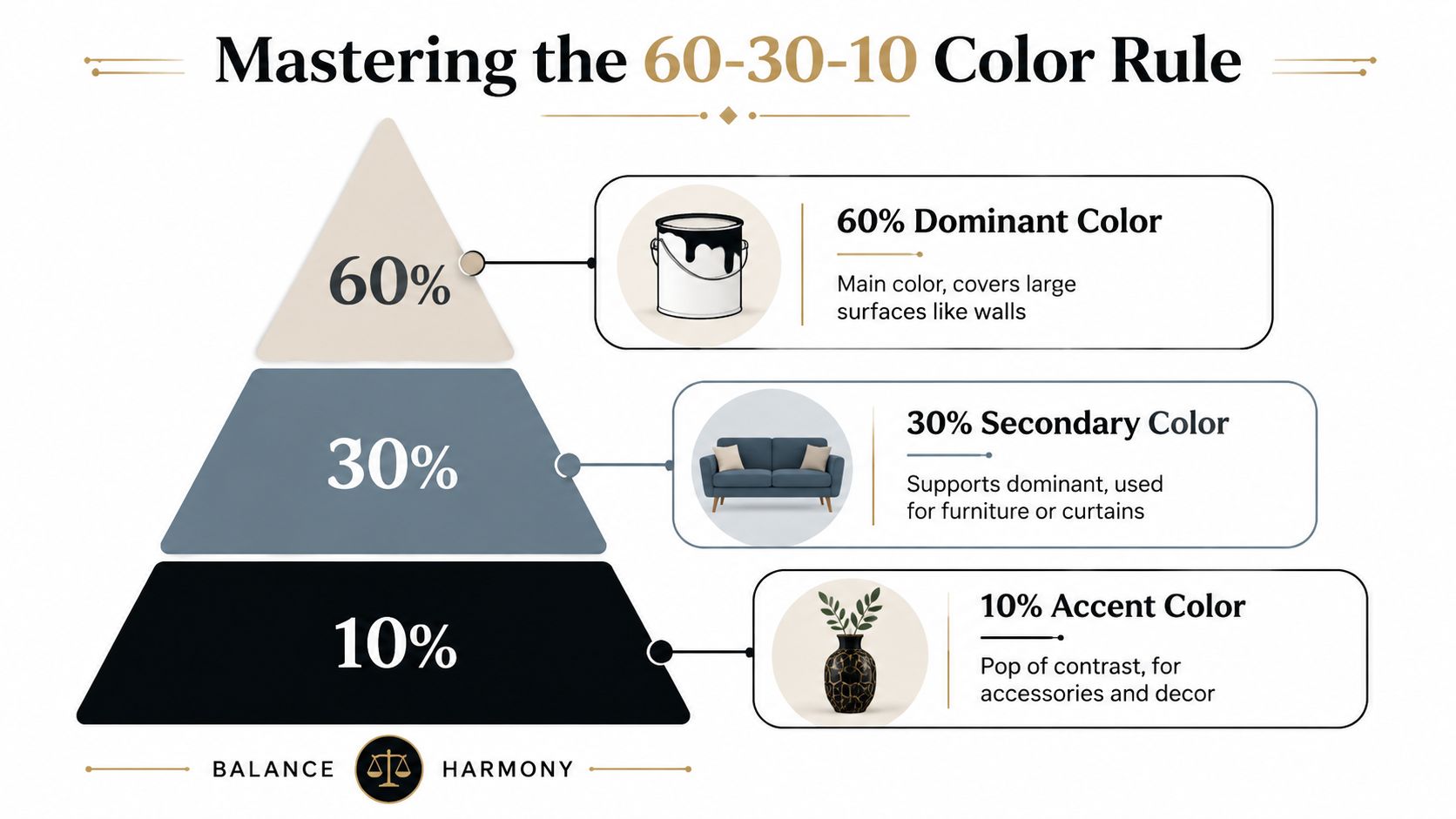
What the rule looks like in a real room
Think of a living room with:
- 60% dominant color. Soft beige walls, a neutral area rug, and light drapery.
- 30% secondary color. A navy sofa or a pair of blue lounge chairs.
- 10% accent color. Brass, rust, or gold in pillows, art, and a vase.
That's enough color to make the room memorable, but not enough to make it exhausting.
Why this rule works so well
Your eye wants a clear order. It wants to know what the room is centered around, what supports it, and what adds contrast.
When every large surface is bold, nothing stands out. When one bold shade is contained to the right share of the room, it reads as deliberate. That's why this framework works so well in family rooms, staged spaces, and open-concept homes.
A quick way to pressure-test your palette is to ask yourself these questions:
- What covers the most square footage? That's usually your 60%.
- What piece deserves visual weight? That's often your 30%.
- What should feel like jewelry? That belongs in the 10%.
Practical rule: If you're nervous about saturated color, don't put it on every major surface. Give it one clear job.
If you want to see how contrast, shape, and focal points work together, this article on creating an eye-catching room is a strong next step.
How to Select Your Ideal Bold Palette
Choosing bold living room colors gets much easier when you stop asking, “What's popular?” and start asking, “What does my room need?”
A sunny room can handle more depth. A dim room needs more care. A busy household needs a palette that still looks good when toys, throws, remotes, and everyday life are part of the picture.

Use the room first, the color second
Sherwin-Williams notes that in smaller or difficult spaces, lighter colors reflect more light to create openness, while dark colors can be used strategically on narrower walls to adjust perceived proportions or add cozy depth, especially when there's strong natural light, as explained in their guidance for difficult spaces.
That means dark color isn't the enemy in a small room. Poor placement is.
Here's the decision framework I recommend:
- If the room gets strong daylight, consider deeper shades like forest green, navy, plum, or rust.
- If the room feels flat or shaded, lean toward a lighter backdrop and bring the boldness in through furniture and textiles.
- If the room is narrow, a darker color on the shorter or narrower wall can change how the proportions read.
- If you want flexibility later, avoid covering every wall in your strongest shade.
Match the palette to the mood
Different rooms ask for different emotional tones. A living room used for conversation and relaxing wants a different palette than one used for entertaining.
A simple guide:
| Mood you want | Color direction |
|---|---|
| Calm and cocooning | Deep blue, olive, charcoal, burgundy |
| Warm and social | Terracotta, mustard, clay, cinnamon |
| Crisp and tailored | Navy, camel, ivory, black accents |
| Bright and expressive | Cobalt, ruby, golden yellow, patterned accents |
If you'd like a few extra visual references before choosing, these living room colour scheme ideas are helpful for seeing how palettes translate into actual spaces.
For a more complete planning process, Gorins also shares an expert's guide to the perfect color palette, which is useful when you're trying to connect wall tone, upholstery, and accent pieces into one cohesive room.
Don't choose your bold color in isolation. Choose it against your flooring, your light, and the way you actually live.
Anchoring Your Room with Bold Custom Furniture
Here's my strongest opinion on this subject. If you want a bold living room and you also want flexibility, make the furniture the hero, not the walls.
Paint is tempting because it looks like the fastest route to drama. It's also the easiest way to overshoot. A saturated sofa, accent chair, or ottoman gives you the same visual punch with far more control.
Why furniture is the smarter move
Design guidance emphasizes layering boldness through accents, textures, and hero furniture pieces rather than relying on one all-over wall color, because that approach is easier to update and more adaptable for resale, as noted in this design video on flexible bold decorating.
That matches what I see in real homes across Norwich, New London, and the surrounding area. People want personality, but they also want options. Tastes shift. Homes change. Families add pets, kids, new flooring, or different lighting. A bold sofa can move with you. A fully color-drenched room is a much bigger commitment.
The best places to go bold
Not every piece should carry the strongest color. Pick one anchor.
Good choices include:
- A sofa in a rich fabric like navy, rust, moss, or merlot.
- A swivel chair or pair of accent chairs in a pattern or jewel tone.
- An upholstered ottoman that adds color at the center of the room.
- Dining-adjacent seating in an open plan if you want color to connect zones.
If you're building a room from scratch, custom furniture options made simple are worth exploring because they let you choose shape, fabric, and finish with more intention than buying off the floor and hoping it all works later.
One practical example is Gorins Furniture & Mattress, which offers custom living room programs such as the F9 Custom Sofa series along with brands like Flexsteel and Best Home Furnishings, giving shoppers thousands of combinations of silhouettes and upholstery choices to tailor a bold piece to the room.
Let texture do half the work
Color alone can fall flat. Texture gives it depth.
A sapphire velvet chair looks different from a sapphire linen chair. The same green changes character in leather, woven fabric, or a subtle pattern. Wood, metal, and nubby textiles also keep a bold room from looking one-note.
A strong color needs a strong material. If the fabric feels dull, the whole room will.
One more smart pairing. If your living room centers around media, a discreet screen can help a colorful room stay refined rather than turning into a tech-heavy focal point. This Home AV Pros Frame TV review is useful if you're trying to keep the television visually quieter while your furniture carries the personality.
Pairing Bold Colors with Paint and Lighting
Once you've chosen the hero piece, the rest of the room should support it. A lot of good ideas go off track at this stage. People pick a bold sofa, then add a competing wall color, shiny trim, harsh bulbs, and too many accent shades. The room gets noisy fast.
The cleaner approach is one lead color, one supporting hue, and one stabilizing neutral. Design guidance also recommends choosing finishes carefully, with matte on broad walls to make saturated pigments look richer and semi-gloss or high-gloss on trim for sharper architectural contrast, as described in Decorilla's advice on bold paint colors.
If this, then that
If your sofa is the boldest thing in the room, keep the walls quieter. Think soft greige, warm ivory, muted taupe, or a gentle gray with the right undertone for your flooring.
If you want colored walls too, they should either support the upholstery or step back from it. Don't force two stars into the same scene.
A simple pairing guide helps:
| If your hero furniture is… | Then your wall direction should be… |
|---|---|
| Deep navy | Warm off-white, soft mushroom, pale greige |
| Emerald or olive | Cream, putty, muted stone |
| Rust or terracotta | Sand, oatmeal, soft clay-neutral |
| Ruby or berry | Blue-based gray, soft beige, warm white |
Finish matters more than people think
A matte finish on larger wall surfaces usually gives bold pigment a richer, steadier look. It doesn't bounce light around as aggressively, so the color reads deeper and calmer.
Trim is different. Semi-gloss or high-gloss can sharpen doors, moldings, and window frames. That small contrast helps architecture stand out, especially in older homes where trim deserves attention.
Light changes everything
A color that looks balanced at noon can feel muddy by evening if the lighting is wrong. Test samples in daylight and under your lamp light before you commit to paint or custom upholstery.
Use layered lighting, not one overhead fixture doing all the work:
- Floor lamps soften dark corners.
- Table lamps warm up saturated fabrics in the evening.
- Wall lighting can highlight artwork and prevent the room from feeling heavy.
Evening light is where many bold rooms either settle beautifully or fall apart. Test for both.
Bring Your Bold Vision to Life at Gorins
The best bold living room colors don't come from brave guesses. They come from good editing.
Pick the mood first. Use strong color where it matters most. Let one piece lead. Support it with a calm backdrop, the right finish, and lighting that makes the room look good after sunset, not just in a photo taken at noon.
That's also why custom makes so much sense. A made-to-order sofa or chair lets you control the boldness with far less risk than coating the whole room in one dramatic paint choice. If you're comparing fabrics, silhouettes, and finishes, getting started with custom order is a practical place to begin.
For our neighbors in Norwich, Plainfield, Waterford, New London, and across Eastern CT and nearby Rhode Island communities, a major advantage is being able to see materials in person and decide what feels right for your lifestyle. That matters with investment-grade quality pieces. So does flexibility. Promotional Financing with equal monthly payments can make a custom or higher-quality living room plan more manageable when you'd rather do it once and do it well.
Since 1936, this family-owned local business has helped people build rooms that feel comfortable, personal, and livable. That's the goal. Not a trendy room. Not a showroom room. Your room, crafted for your lifestyle.
Visit Gorins Furniture & Mattress to see bold fabrics, custom upholstery options, and living room furniture in person at the Norwich showroom. If you're still narrowing down your look, take the online Style Quiz. If value is the priority, browse the Clearance section for affordable luxury and smart savings. Since 1936, Gorins has helped Norwich and Eastern CT families create homes they love with quality, value, and helpful local service.